
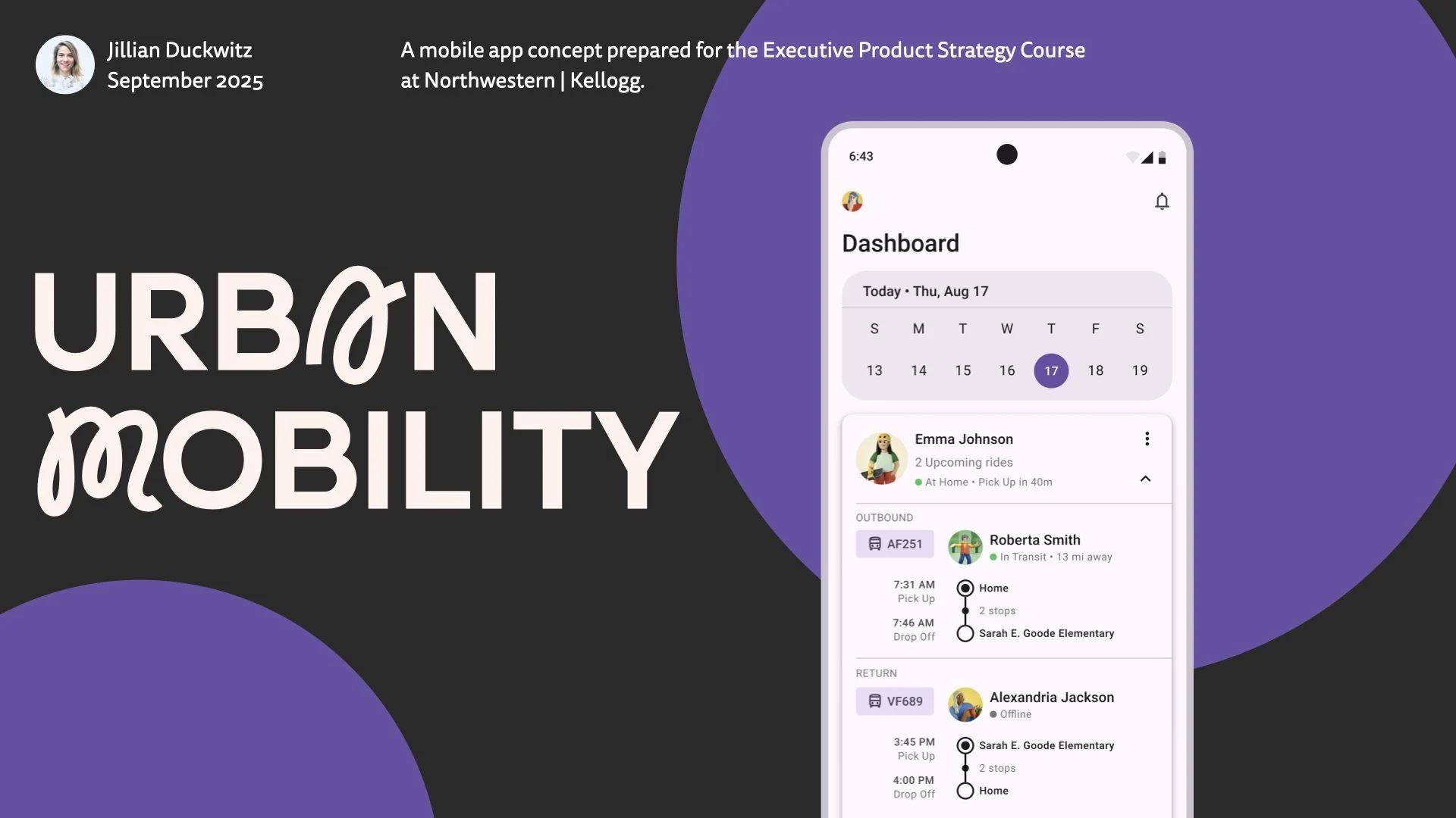
URBAN MOBILITY
I Design for Outcomes. So I Tested Whether AI Does Too.
IN A NUTSHELL
The Kellogg Executive Product Strategy course asked for simple wireframes and a jobs-to-be-done analysis for an urban K-8 transportation mobile app.
I delivered a high-fidelity concept with realistic data points — then used it to run three experiments with three distinct Claude tools to determine if AI might be worth incorporating into my design workflow.
MY ROLE
Product Strategist & Designer
RESPONSIBILITIES
Jobs-to-be-done research, interaction design, high-fidelity prototyping, AI tool evaluation, design systems governance & analysis
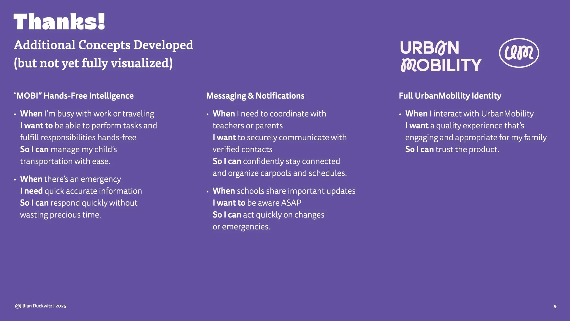
TIMELINE
Original Assignment: September 2025
Claude Experimentation: June 2026
COLLABORATORS
Claude.ai, Claude Code & Claude Design
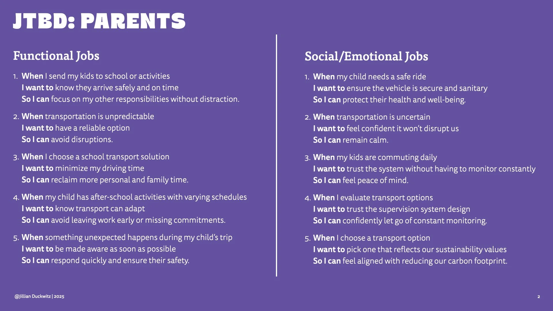
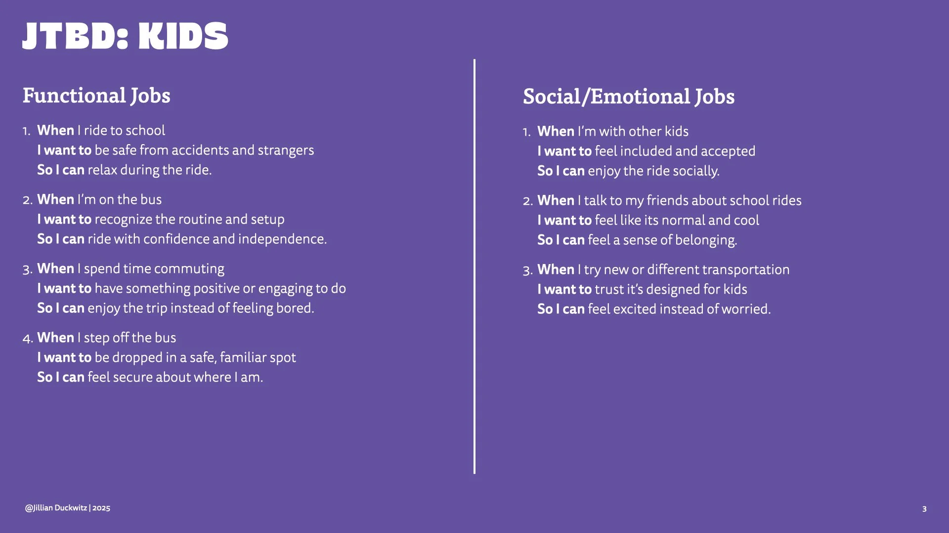
This began as a wireframing assignment for Northwestern Kellogg's Executive Product Strategy program: a mobile app for transporting K-8 children in urban areas. The assignment asked for three wireframes. I delivered those, plus a full jobs-to-be-done analysis for parents and kids, and a design rationale for each screen.
Rationale is what separates a sketch from a decision. Showing why matters.
CONTEXT
I didn't want to waste time polishing something hollow. Could it take the thinking I'd already done and turn it into something decent — or better?
How well can AI faithfully execute a vision based solely on strategic inputs?
Claude.ai — build from strategy alone
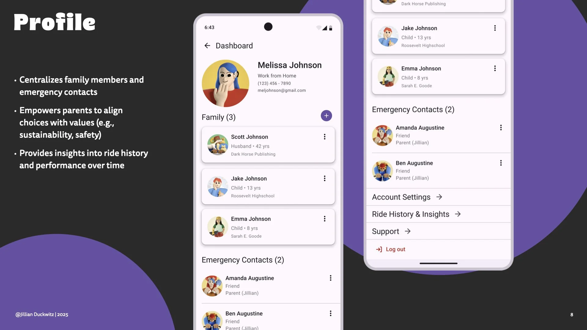
I handed Claude.ai my entire project deck. A jobs-to-be-done analysis for two distinct users: parents and kids. Six core high-fidelity screens I built manually in Figma with the Material Design System, each with a clear intent and rationale.
EXPERIMENT 1
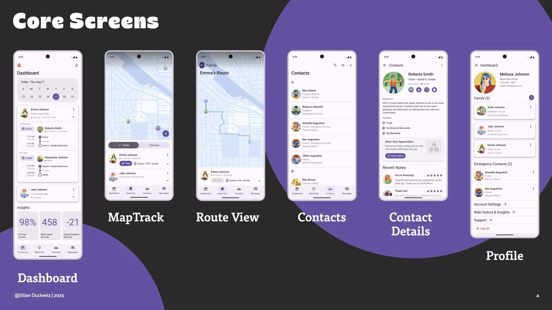
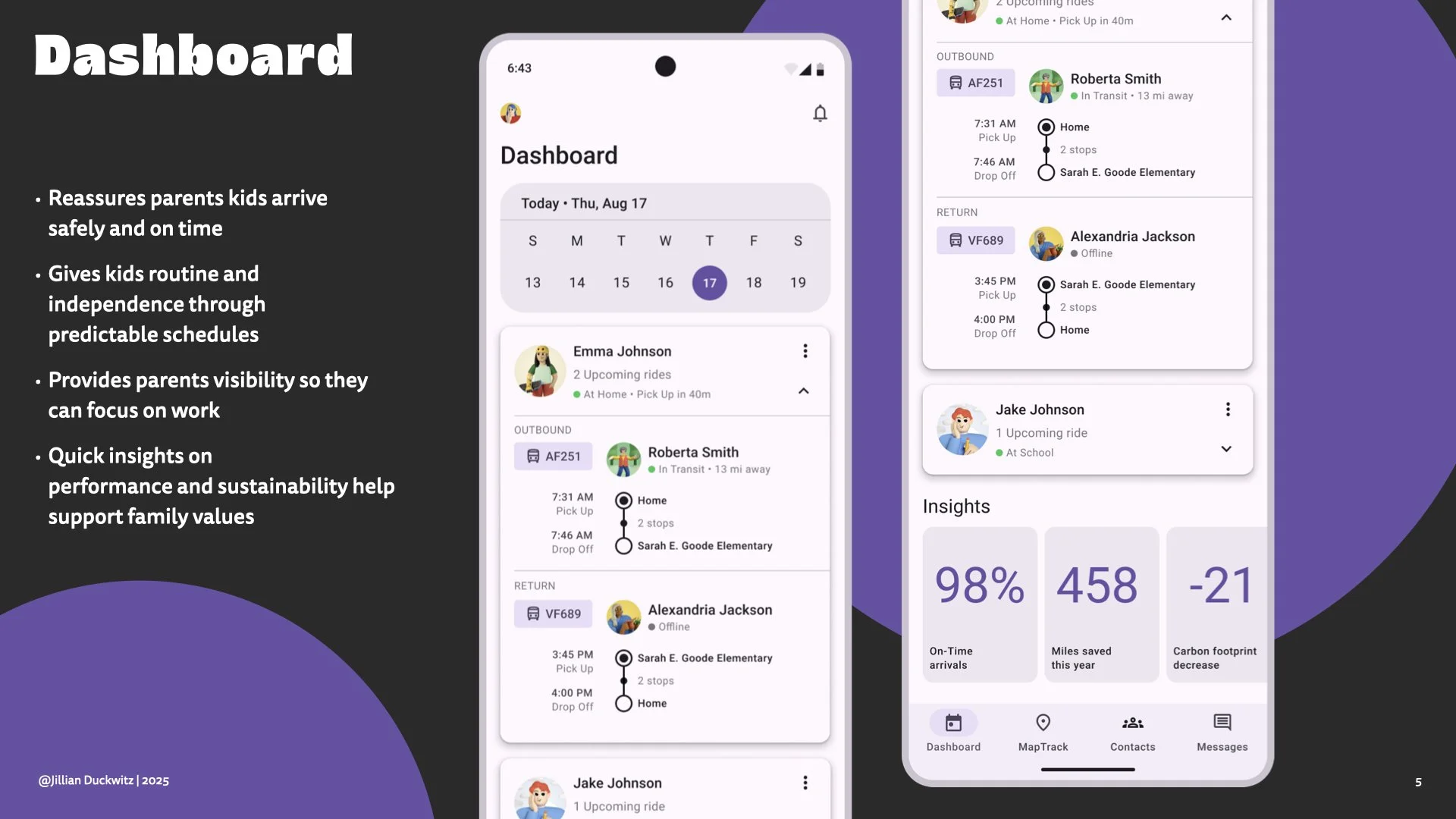
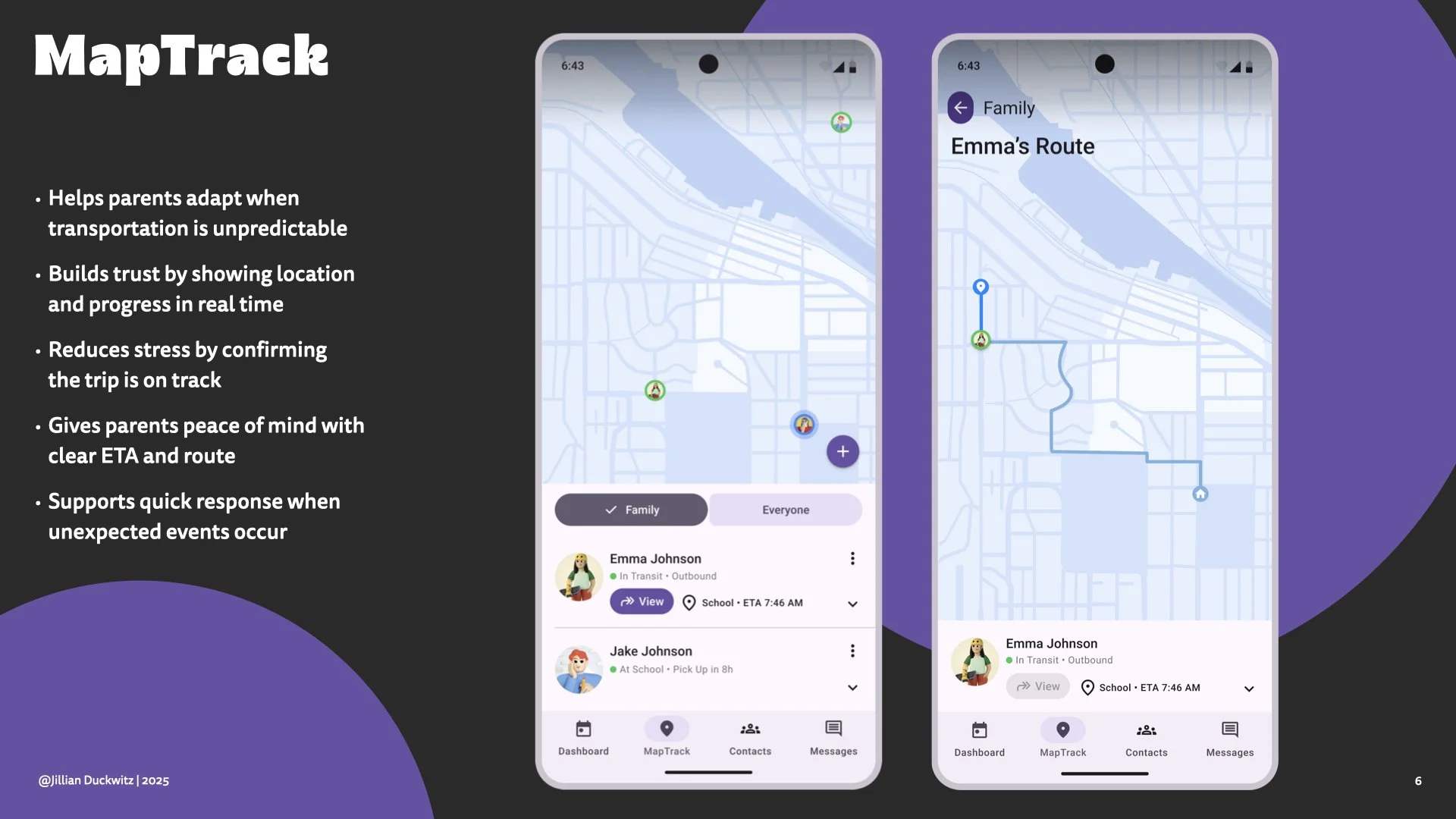
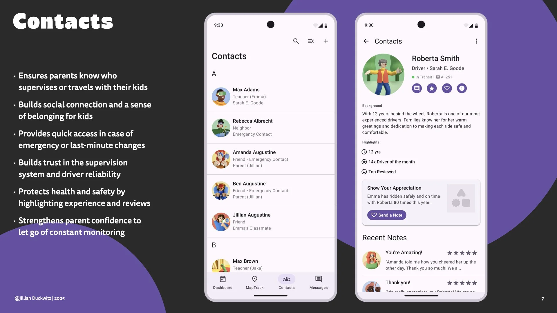
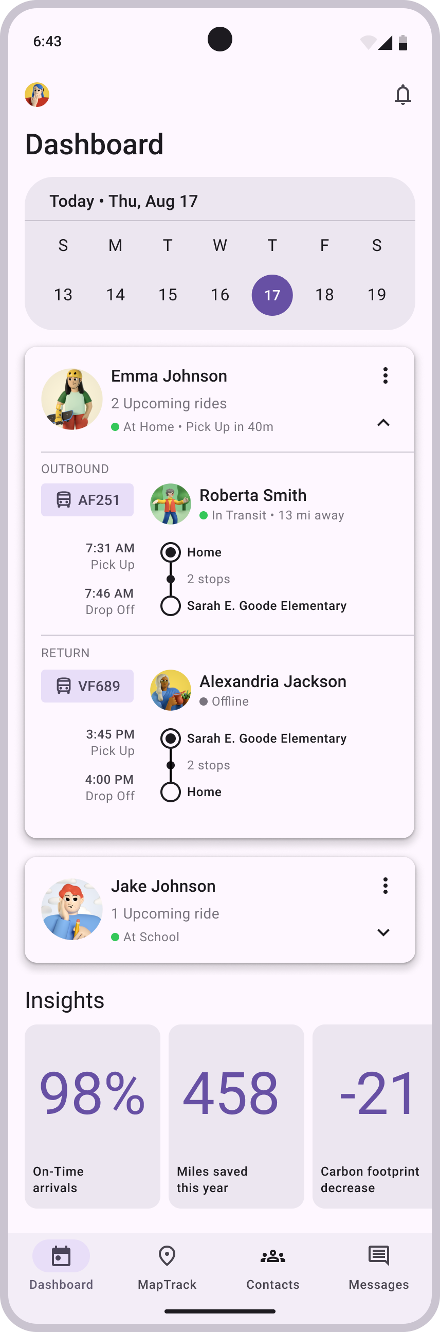
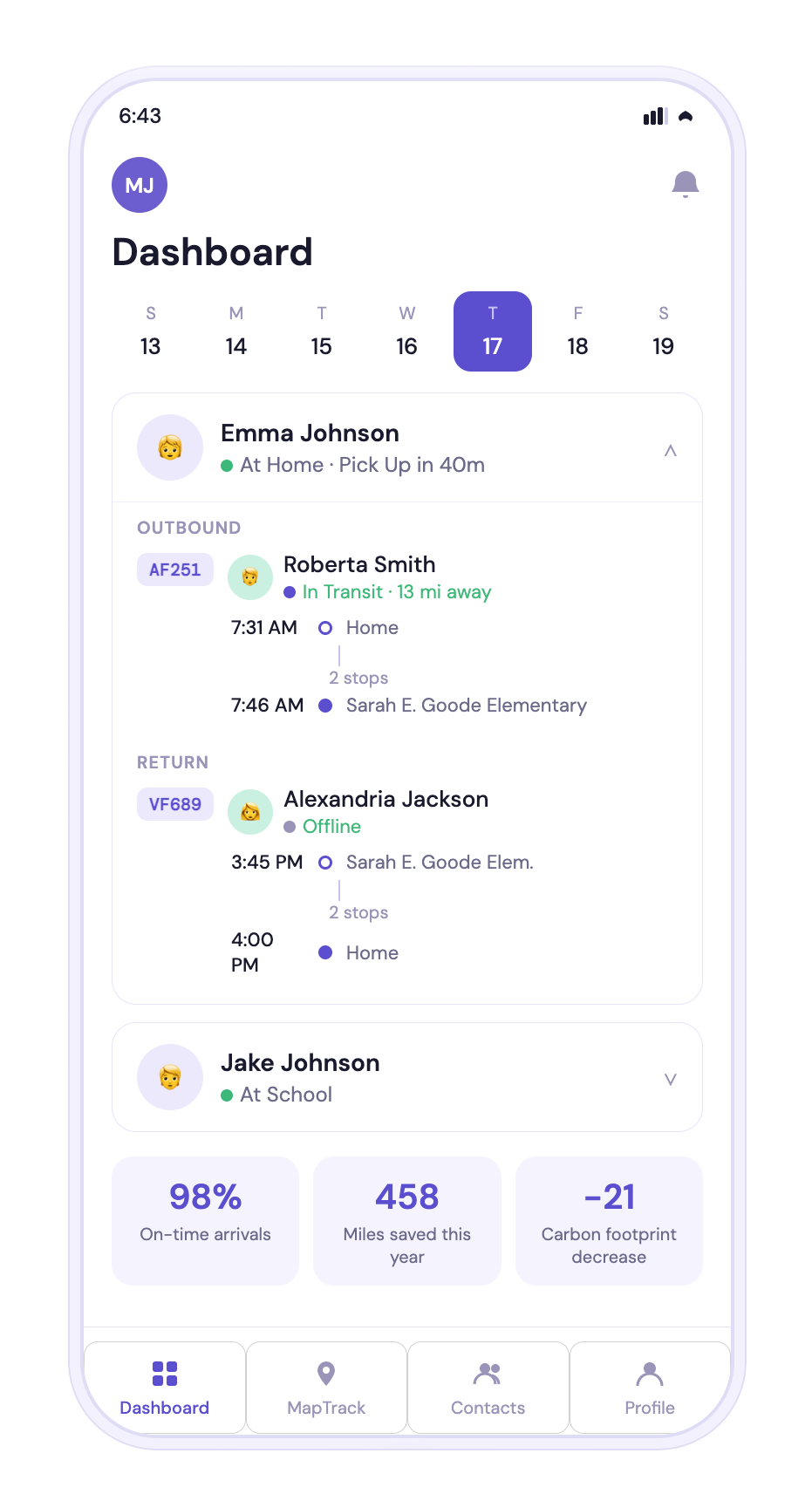
The Detailed Comparison
DIVERGENCES
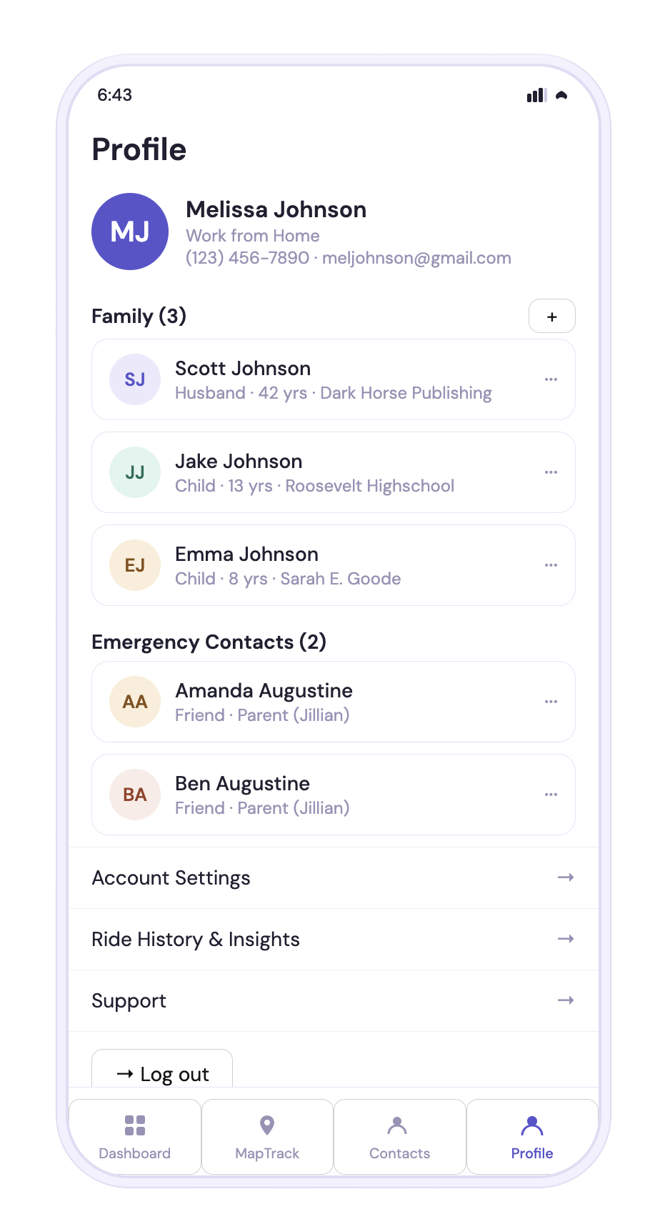
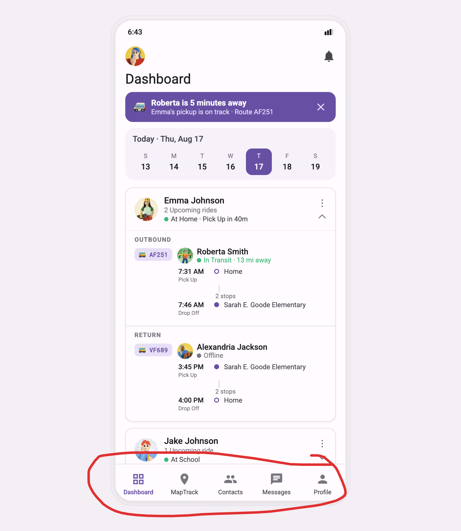
Changed the navigation — I designed the nav explicitly, and it couldn't hold it. Here it dropped the Messages tab and put Profile in its place.
Made up its own design system — instead of using the one I gave it, it substituted emoji and monograms for my illustrated avatars, and used the wrong typeface; ultimately, its own blatantly “Claude” look and feel.
Its execution is sloppy — the made-up system isn't even applied cleanly. Icons that should read as a set don't. The ride timeline is redrawn unaligned. The bottom nav — one component, meant to look identical everywhere — shows a two-person Contacts icon on the Dashboard but a single-person one on every other tab. It abbreviated text inconsistently; the hierarchy and visual distinction I'd designed are muddied.
WHY IT MATTERS
These aren't equal. Making up its own system, sloppily, is the tool defaulting when I'd handed it something better to work from. Dropping a navigation tab I'd explicitly designed is worse — it overrode a decision it could plainly see, with the answer right in front of it.
Dashboard
DIVERGENCES
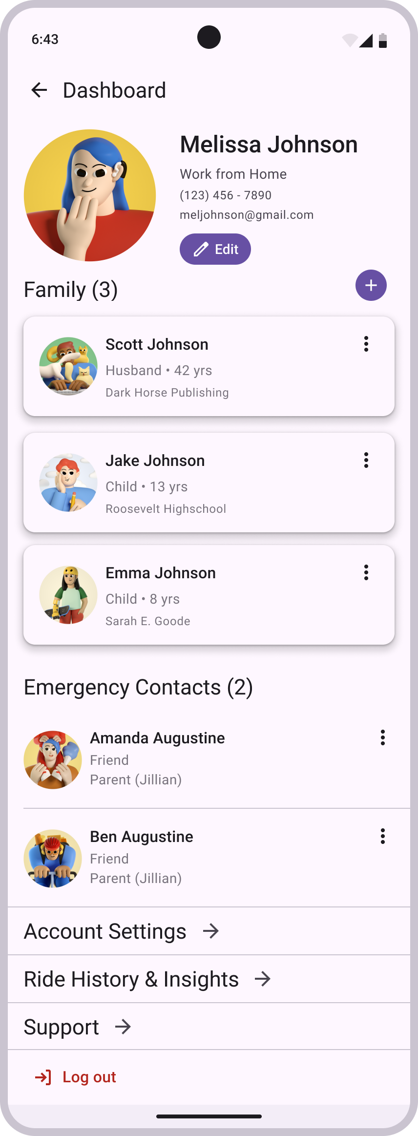
Left off the edit button. My Profile had a control to edit the profile; Claude's version doesn't.
This is also the screen it promoted into the nav — the other half of the Messages swap covered above.
WHY IT MATTERS
A profile you can't edit is functionally incomplete. And it's gone, with nothing flagging its absence. It looks finished, and it isn't.
Profile
DIVERGENCES
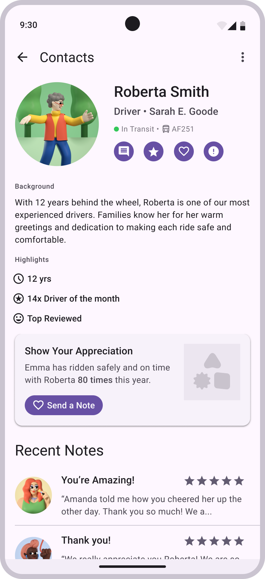
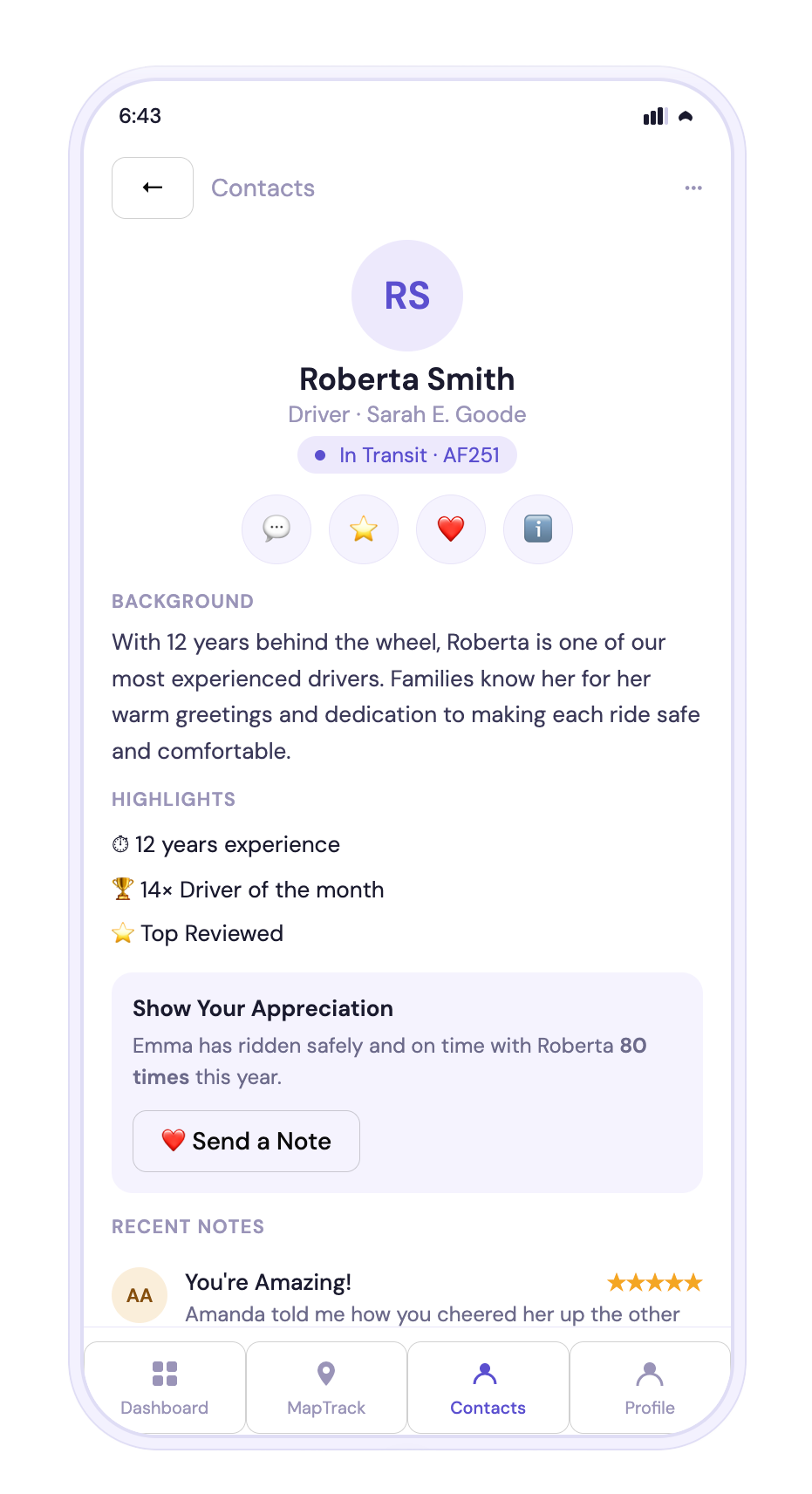
Added navigation to a screen that shouldn't have any. This is a detail view — one level down, reached by tapping a contact, left by the back arrow. My version has no bottom nav, because a drill-in isn't a top-level destination. Claude added the full nav bar anyway.
WHY IT MATTERS
On the Dashboard, it changed a nav I'd built. Here, it added one that shouldn't exist — because it doesn't recognize that a detail screen is a different kind of screen. It doesn't understand where navigation belongs, only that navigation is something it places.
Contact Detail
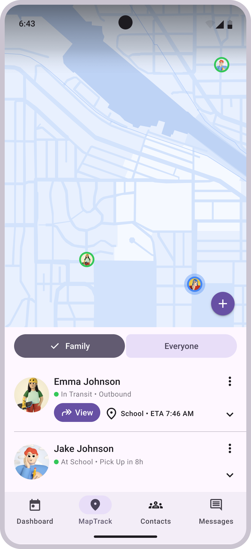
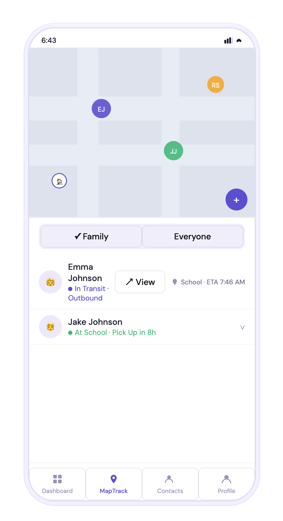
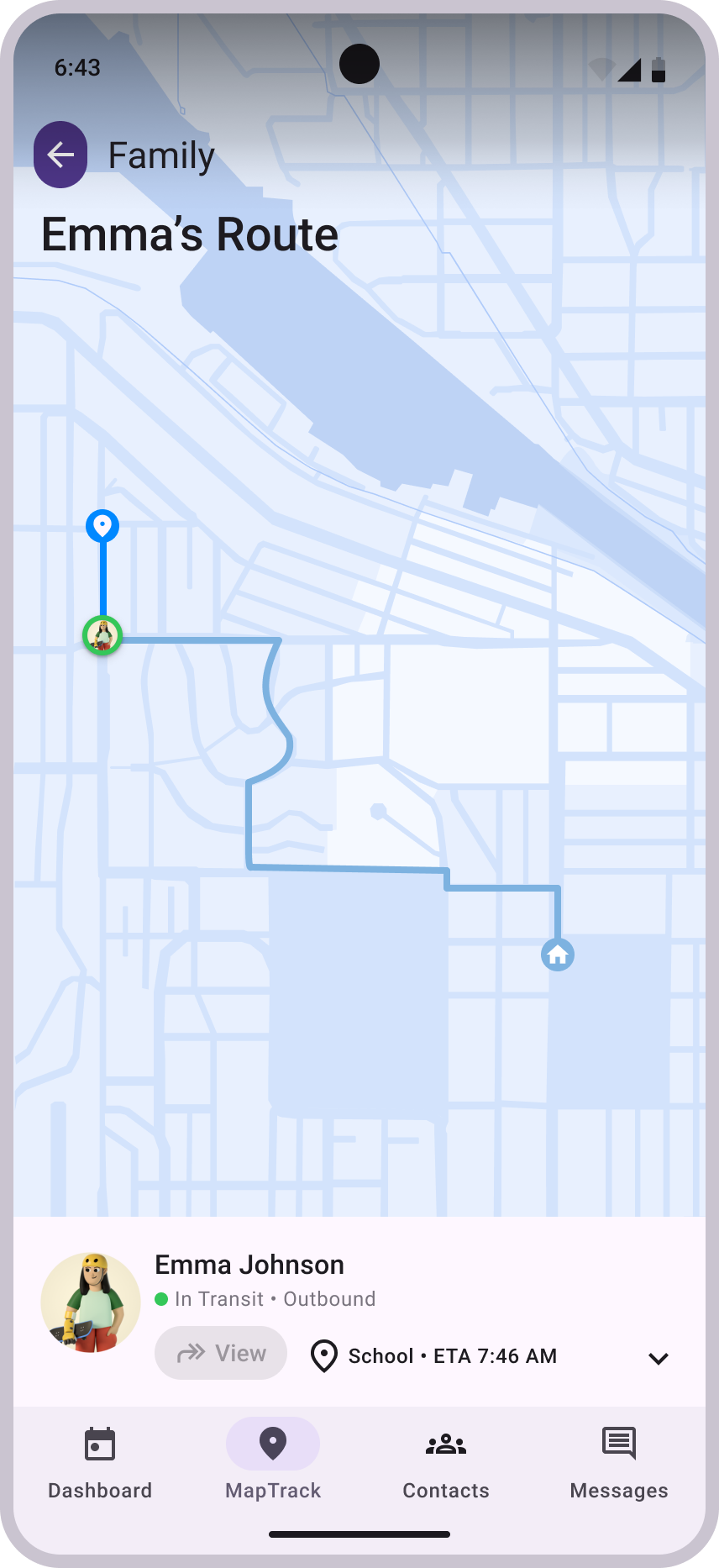
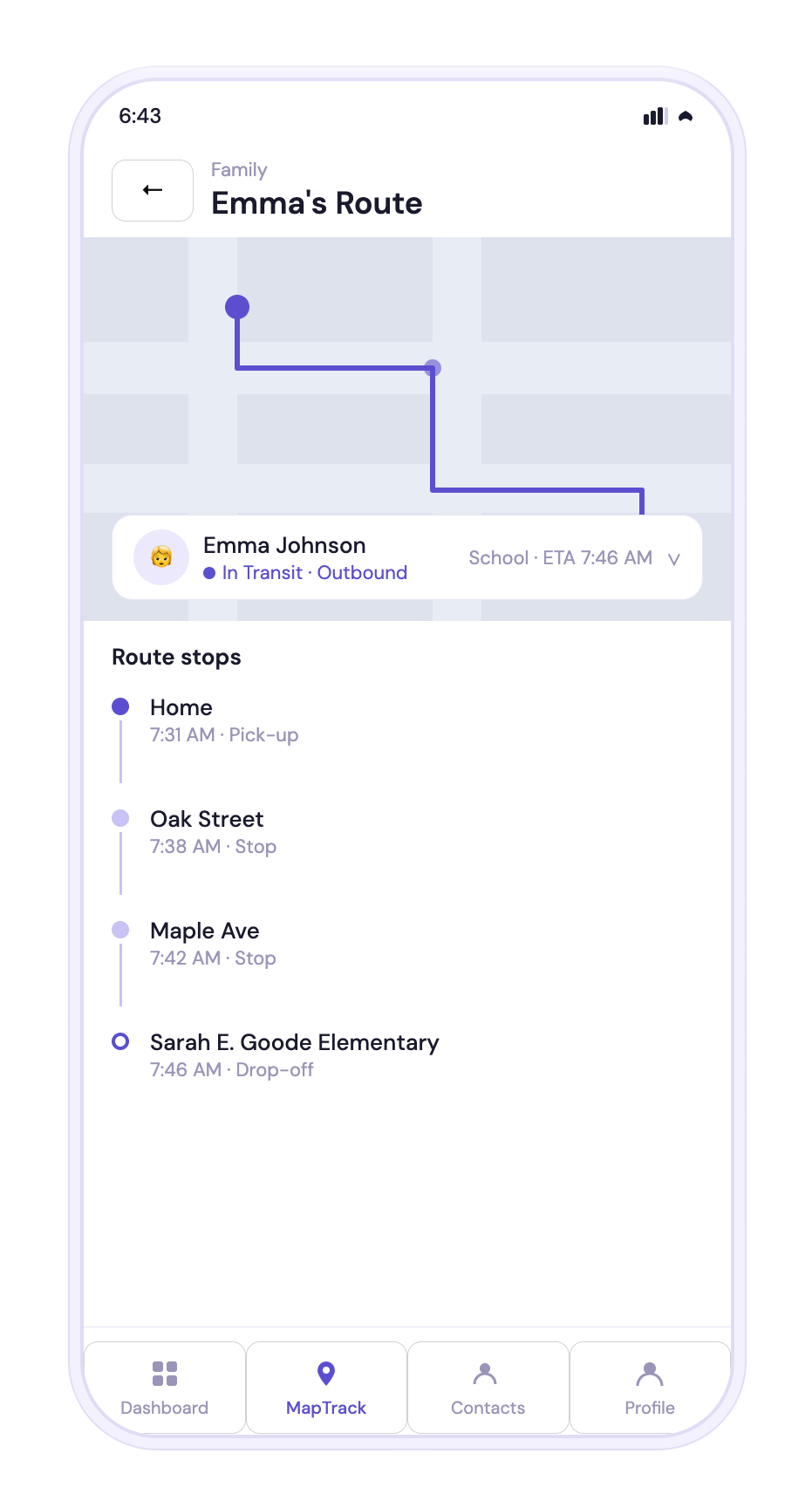
DIVERGENCES
Redrew the same component two ways. The person cell appears on both screens. In my design, it's one component, identical in both. Claude drew it two different ways and created unnecessary inconsistencies.
Missed what the chevron meant. In my design, the chevron marks a row that expands — tap it, and the person's route unfolds in place. Claude kept the chevron but not the behavior behind it. It treated the symbol as decoration and missed the progressive-disclosure affordance it represents.
Inverted the interaction model. Mine leads with the map, then drills into a route. Claude shrank the map and turned the route into a text list.
Broke the segmented control. The Family / Everyone toggle shows no active state — you can't tell which view you're in. In the prototype, the checkmark icon stays on the Family segment.
WHY IT MATTERS
It had already built the right component on one screen, then rebuilt it differently on the next. It can't reuse its own work — or the discipline a system runs on.
MapTrack & Route Detail

Experiment 1 Result
Claude.ai produced a navigable six-screen prototype from the deck alone — and at a glance, it looked like a real app. It had built its design system, keeping the broad structure while quietly re-authoring the details I'd deliberately chosen.
SEE FOR YOURSELF
Tap through the actual build. Many of the divergences are odd and tedious—like the Contacts icon that changes between tabs—hard to justify, and they defeat the purpose of a tool meant to speed up prototyping.
Claude Code — extend the system correctly
After Experiment 1, I knew it wouldn't hold my design alone — so I gave Claude Code, the tool built for this, every advantage: Material Design 3, the exact specs, a live Figma connection, and me correcting it the whole way.
EXPERIMENT 2
Experiment 2: A Fix-and-Revert Loop
The pitch: connect your Figma files, and it reads your design with "pixel-perfect fidelity." On the first pass, with no connection, it drew its own icons because it "could only see the Figma as a screenshot." So I did the full setup — connected Figma through an MCP server, generated the access token, and gave it live access to the source file. The exact thing meant to fix this. Nothing changed.
The Promise
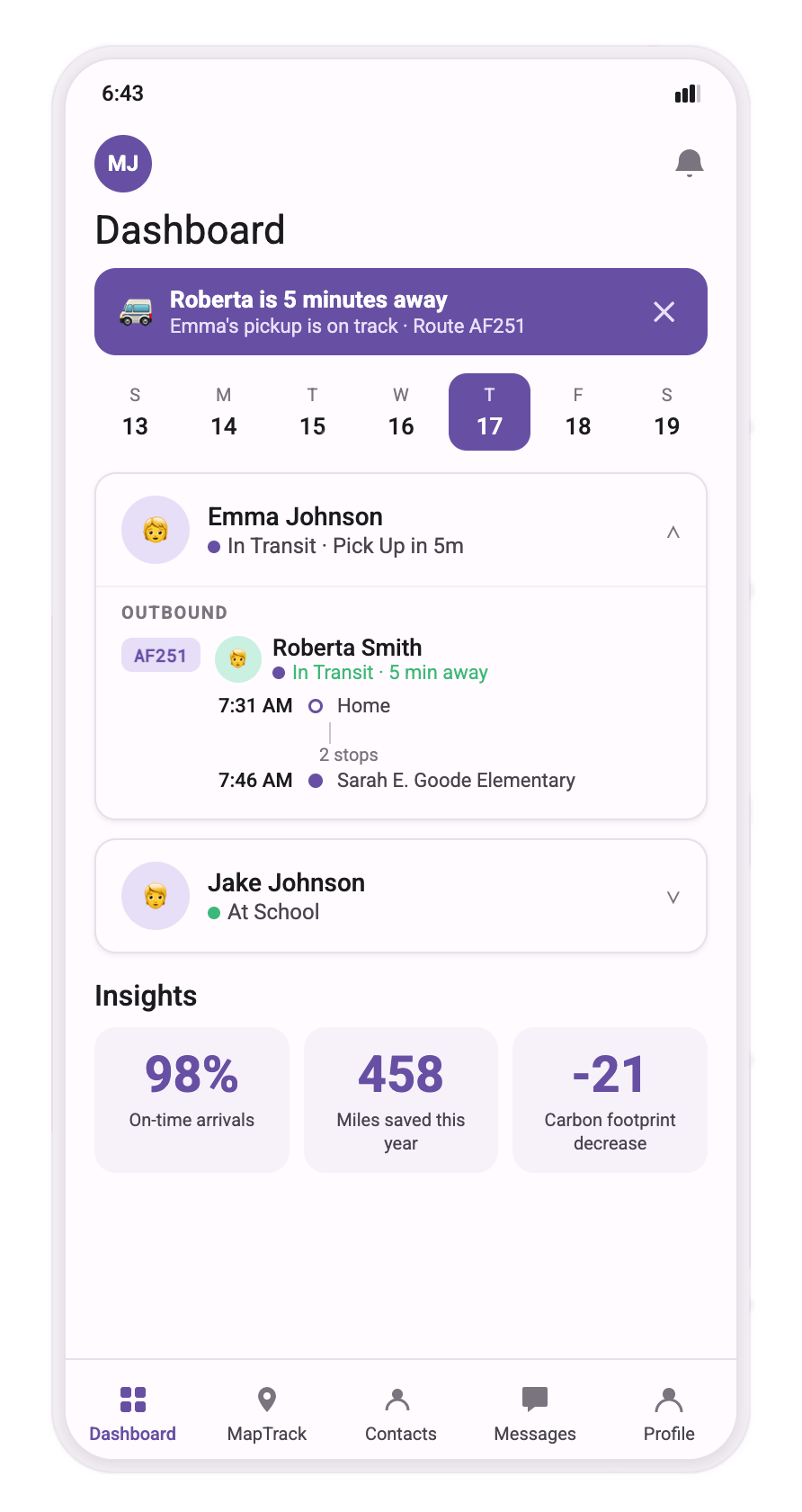


FIRST OUTPUT
It used the right typeface and colors and added the expected functionality. Some of Experiment 1’s issues were addressed automatically. The notification was added (though not perfectly to Material Design), and it generated the Messages screen as asked. But many of the same mistakes from Experiment 1 crept in, along with new ones: it used nearly identical icons for Contacts and Profile — two tabs that should read as distinct.
Getting it right took several hours of back-and-forth — correcting spacing, alignment, typography, contrast, and route layout, one item at a time. It reported completion and parity the whole time, even though the problems stayed on screen. I'd fix the numbers; it would revert them. The Insights label vanished and reappeared. Each edit could quietly undo an earlier one. The functionality worked. The fidelity was me.

The Cost
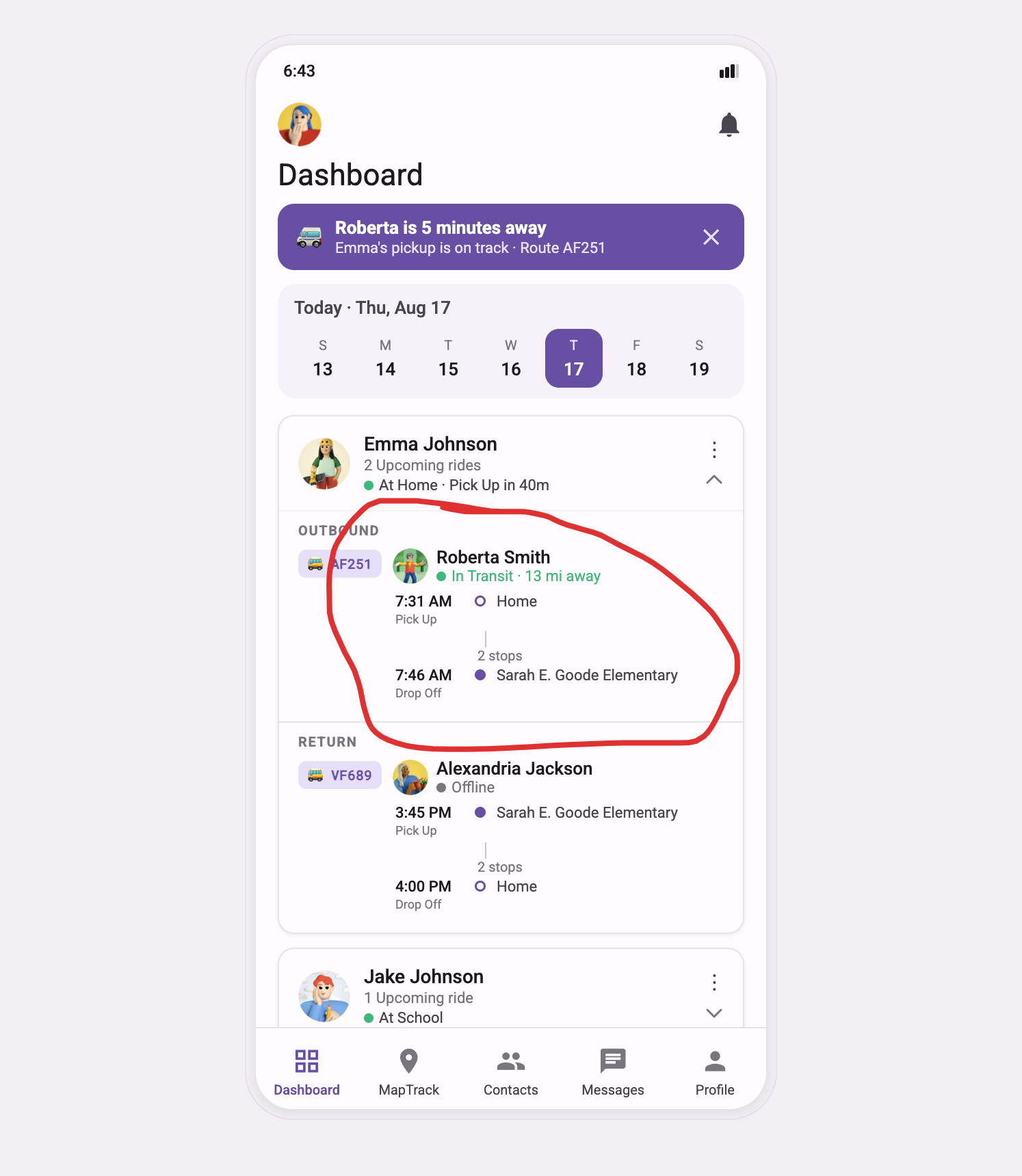

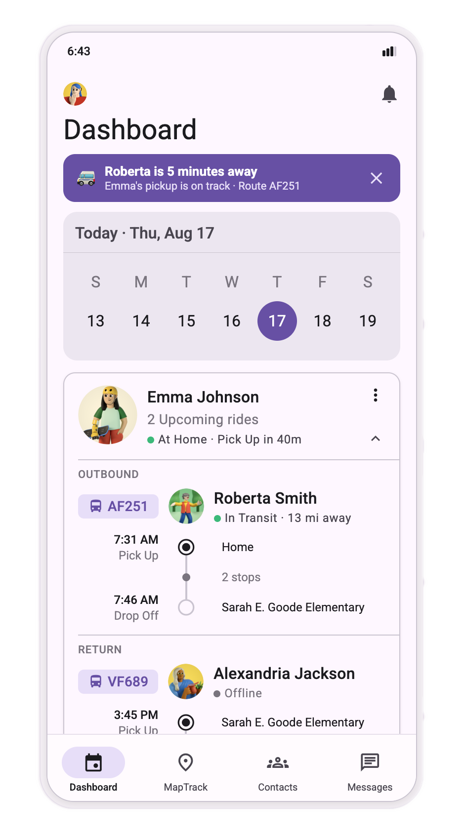
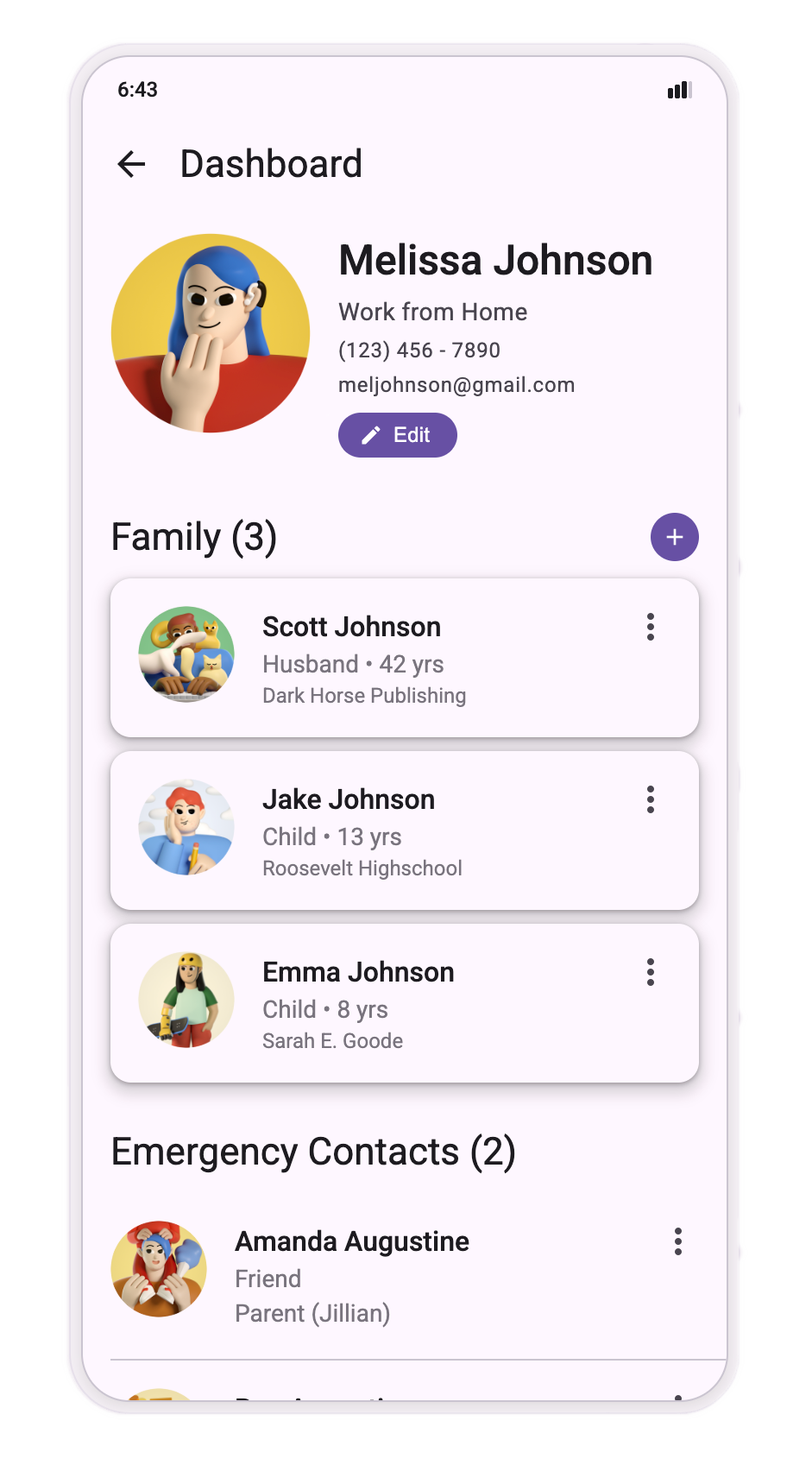
FINAL OUTPUT
After hours of corrections and reprompting, these two—Dashboard and Profile—were the only screens I could push close to my design; the effort stopped being worth it.

Experiment 2 Result
Claude Code built real features and got closer than Claude.ai — right typeface, right colors. But even with the live Figma file in hand, it still drifted: its own icons, fixes that reverted, a design it could see but didn't follow. The tool promised pixel-perfect fidelity. What I got instead was hours of correction at my own expense.
Claude Design — build without a designer
I moved to Claude Design, the tool pitched as removing the need for a designer altogether: prompt-to-prototype, no Figma required. I gave it more than the pitch calls for anyway — the .fig file itself, uploaded directly, plus the exact color values and Material 3 named outright.
EXPERIMENT 3
Experiment 3: A System That Didn't Survive Contact
Step 1: The Input
Uploaded the Urban Mobility .fig file directly into Claude Design's "Create here" path, plus color notes in the setup field.
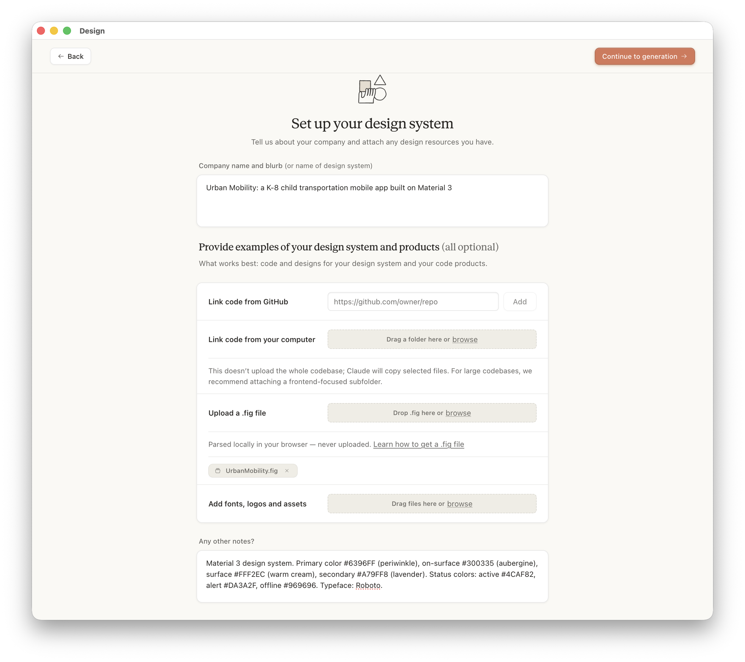
Step 2: The System (Output)
It built a design system first — tokens, 19 components across 10 groups, matched to my Figma's component naming. Organized. Thorough-looking.
Step 3: The Prototype (Output)
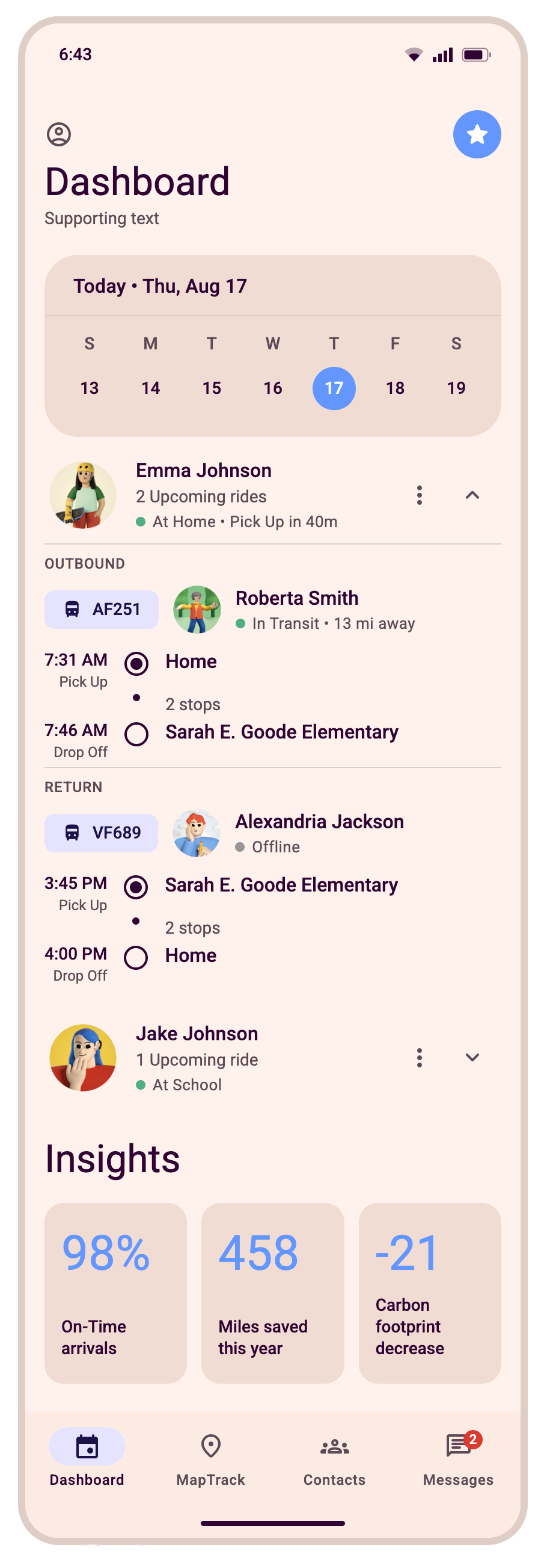
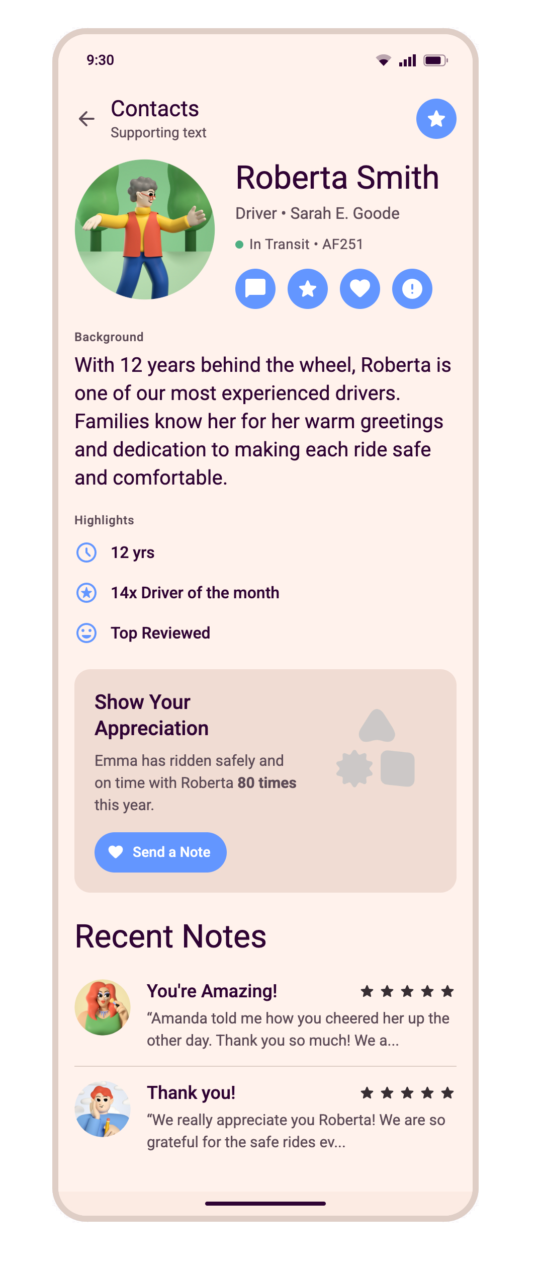
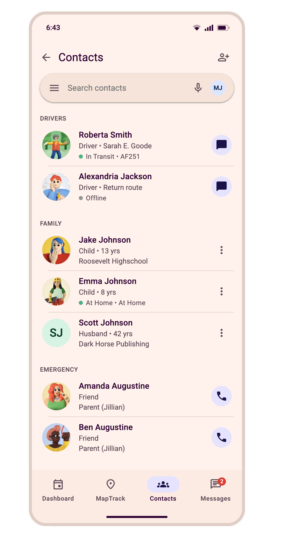
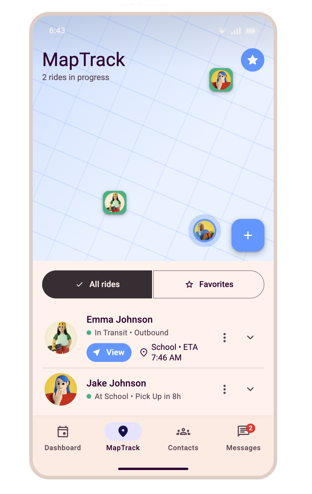
Then came the screens, and the system it had just built didn't survive contact with them. Several "Instant preview" attempts failed with no explanation. The final render got colors and system both wrong — and introduced things nobody asked for, repeated across screens without explanation: a star icon in the header on three of five screens, a "Supporting text" placeholder left unfilled on both Dashboard and Contacts. Route stop alignment, still wrong.
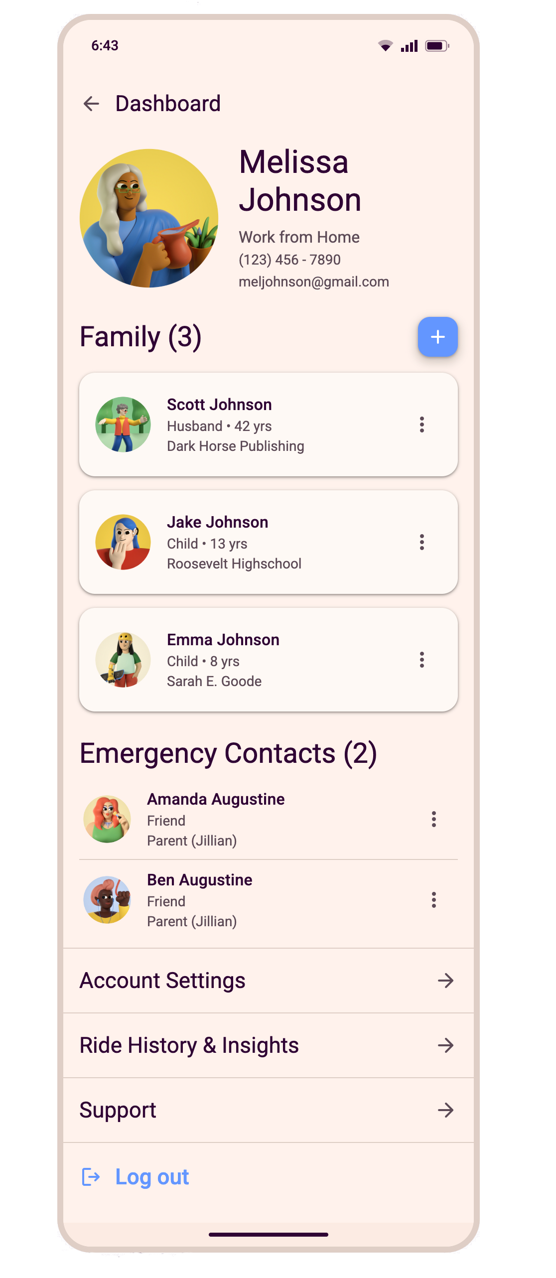

Experiment 3 Result
Claude Design built a design system that looked complete—organized, thoroughly named, and matched to my Figma vocabulary—but then couldn't build screens that held it. Wrong colors, an unauthorized star icon repeated across screens, a placeholder line left unfilled on two of them. And when I went to pull the system out to show it, there was nothing to export—PDF, video, PowerPoint, a zip of raw files —none of it a usable design system. A tool sold as removing the need for a designer still needed one to catch what it got wrong, and couldn't even hand back what it built.
Observations
More access didn't fix anything.
Claude.ai had a deck. Claude Code had the live file, exact specs, and real-time correction. Claude Design had the .fig file and Material 3 named outright. Each got more than the last. None held the design.
The failures looked confident, not broken.
A design system it wasn't given, built and substituted in twice — once from nothing, once over Material 3 itself, with Figma file and hex values in hand. A star icon nobody asked for, repeated across screens. A tab that moved without explanation. A design system with nowhere to export it.
Catching it required knowing the answer already.
Every miss was only visible to someone who knew what the work should have looked like going in. Without that, it ships.
The correction work was the real cost.
Hours spent fixing, rechecking, and re-prompting — work that didn't show up as "AI took longer"; it showed up as my time, disguised as the tool's speed.
Every promise was specific, and every one broke the same way.
"Pixel-perfect fidelity" from a live file connection. "No design background required" from a tool built to replace one. Each pitch named exactly what it would deliver. Each one delivered the opposite and needed a designer to hold its hand.
IN CLOSING
So now what?
None of this makes the tools go away, and none of it makes the work easier. It proved that knowing what a good design decision looks like isn't a skill these tools have. For me, it clarified what actually matters.